Incorporating Branding into Interior Design
- StudioSMC
- Mar 13, 2023
- 4 min read
Updated: May 4, 2023


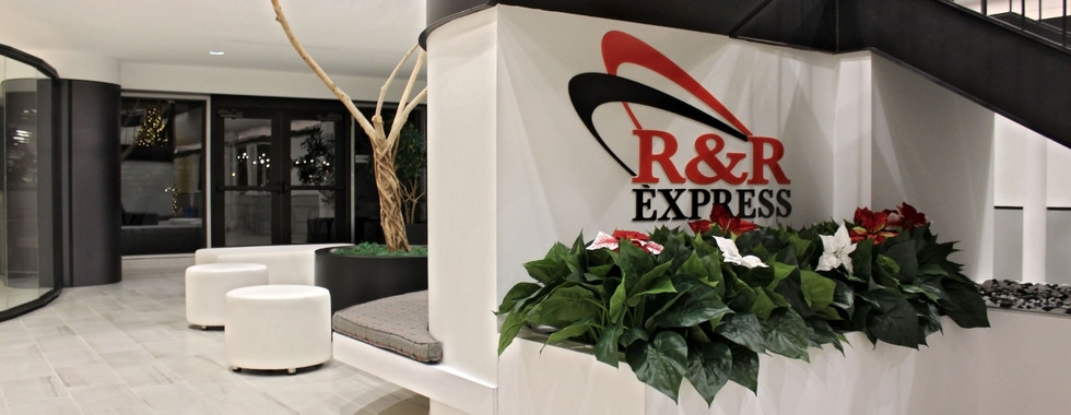
R&R Express
INCORPORATING BRANDING
INTO INTERIOR DESIGN
How to efficiently and tastefully incorporate a company’s branding
into the interior design of a space.
THE OBVIOUS:
COLOR
One of the most distinguishing components of branding is color. Let’s consider McDonalds. Upon entering a McDonald's restaurant, the use of red and yellow is a predominant factor in the design. Whether it's floor tile, laminate counters, seating, or wall graphics, the use of corporate colors is present.
Color is an obvious indicator of a company’s brand. Using corporate colors throughout your space is a great way to incorporate your branding. It sets the tone for the space and the foundation for the color palette and atmosphere.
Color is also one of the simplest — and perhaps most effective — ways to brand an interior design. Here are a few easy ideas to work company colors into your office space:
Paint a solid-color accent wall
Include bright touches like throw pillows and vases
Make use of colored furniture
Consider colored carpeting, rugs, or curtains
Incorporate colors within your finishes
Sometimes using the exact branding colors, such as a specific Pantone number that is used for a logo, does not complement the vibe you are trying to create within a space. We must consider the psychology of color and how it affects moods. Using different shades of your corporate colors is a good way to subtly introduce branding into your space. For example, you might not want to use a bright pink paint for an accent wall in your office, but perhaps a faded, light pink paint works better and helps translate your design intent and atmosphere throughout the space.
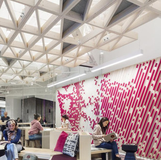
Other times, using the punchy, bright colors of your logo and branding is exactly what you want. T Mobile does a great job of using their brand colors throughout their corporate office, creating a sophisticated, yet energetic atmosphere that reflects their company culture and image.
GET CREATIVE:
GEOMETRY AND MATERIALS
Another way to incorporate branding into your space is to utilize geometry. Deconstruct your logo - take shapes and forms and use them throughout the office in different ways. For example, if your logo contains organic movement or circles, specify round pendant lights over a casual seating area.
Your business logo is hugely important to your brand and recognizability. But even though your logo is the most important piece of imagery for your brand, it should not be an overbearing theme in your office design. Not only does it look tacky, but it can dilute the effect of the image. But there is a subtler way to incorporate your logo into your office interior: breaking the image down into its most basic geometric shapes.
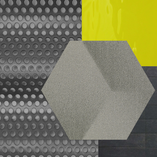
Polygons are incredibly versatile in architecture and design. Work these shapes into textile patterns to use for curtains, carpeting, or furniture. Use composite materials to create sleek, geometric surfaces to use as desks or shelving. These strategies can help you achieve visual unity without logo-overkill. (San Diego Office Design)
Utilizing materials that are relative to the product or service you are selling is another great way to incorporate branding. Integrating metal textures such as wall cladding or exposing steel columns would be a fitting design statement for an industrial business. On the other hand, showcasing marble floors and high-end leather fabrics would display the sophistication of an elite office building providing high-end services.
MAKE A STATEMENT:
THE ART OF BRANDING
Professional photos of what you produce or the service you provide are great ways to showcase your prowess. Artwork that is identifiable with or iconic to the industry you are in can be a powerful, moving statement. Additionally, photos that reflect the company values or inspirational photography can be great aesthetics as well as boosters of morale and pride. (RI)
Nothing is a better representation of your brand than your products and services, so let them speak for your company! Displaying prints that showcase your work will both highlight your achievements and add some branded visual interest to your office space.
Does your company sell consumer goods? Then consider hanging a series of acrylic product photos or design blueprints in your lobby. Is your business more of a consulting firm or a non-profit? Display artful prints of projects in which your team has been involved.
Of course, not every company has a product or service that is particularly photogenic. But even if the day-to-day realities of your business don’t translate well to photographs, prints can still be used as a means of decorative branding. A surgeon’s office, for example, might choose to display tasteful anatomical drawings in their waiting room. (San Diego Office Design)

SHOWCASE CULTURE +
BRAND RECOGNITION
A brand does not end with a logo, it carries through into the customer experience; therefore, it is important to remember that interior design is essentially an extension of a business’s customer service and brand identity.
Regardless if your business is product or service based, the interior design of your space should reflect the characteristics and brand of your product or service. For example, Apple products are designed with clean lines, neutral colors, and a minimal aesthetic. If you visit an Apple retail store, you can immediately recognize that they have applied the same design concept to the physical design of their stores. Many people may not consciously recognize this connection, but it makes their stores easily recognizable, and their overall brand very cohesive.
The true test of interior design branding is this – if you removed all of the logos and branding graphics from your business space, and a stranger entered, would they recognize that they are standing in your business’s space? If so, your branded interior is a success! This will make your brand and business easily recognizable, and attractive to your target audience. (JDG)
Office layouts are a subtle but important way to reinforce a clear brand message. For example, a casual open-concept design makes a lot of sense for a company that prioritizes employee communication and collaboration, while a more traditional minimalist approach would benefit a business that centers itself around efficiency.
By carefully choosing how to connect work areas together, you can design a workplace layout that aligns perfectly with company culture. (Endless Knot)
Looking to incorporate branding into your space? Reach out to us at design@studio-smc.com or fill out our contact form here. We’d love the opportunity to work together!


Comments